Digital Art & Coloring · Aug 21, 2026 · 12 min read
Static Stream Background Setup: Match a 16:9 Scene to OBS, Camera, and Text
A practical file-fit and scene-building guide for choosing a 1920×1080 static background, placing it in OBS, and checking camera, avatar, game, and text readability before going live.
Start with the job a static background can actually do
A static stream background is one still image placed behind the other parts of a scene. It can establish a room, color palette, or visual mood without requiring a video loop. It does not automatically include a webcam frame, alerts, chat widgets, scene labels, transitions, audio, or an animated overlay. Those are separate sources or design elements, so decide whether you need a background image or a complete stream package before comparing artwork.
The SteadyStackStudio landscape packs featured in this guide are currently described as four finished 1920×1080 JPG backgrounds plus PNG exports of the same four backgrounds and a README/license note. They are instant digital downloads; nothing physical is shipped. The listings identify them as static files and do not list MP4 animation in these packages. That makes them a straightforward fit when you want a still 16:9 foundation that you can arrange inside your own scene.
Write down the first scene you need to build. A camera-led conversation scene, a Vtuber room, a game scene, and a full-screen break card all place content differently. A background that looks attractive by itself may become crowded once a face, avatar, gameplay window, captions, and alerts are added. Choose for the finished composition, not for the empty image alone.
- Choose a static pack when a still image is the missing layer.
- Do not assume that backgrounds include widgets, frames, transitions, labels, audio, or animation.
- Confirm the current listing shows four 1920×1080 JPGs, four matching PNG exports, and a README/license note.
- Name the first scene you will build before judging the artwork.
Check 16:9 file fit before choosing a visual style
The listed 1920×1080 size has a 16:9 landscape shape. That is different from a 1080×1920 vertical 9:16 background intended for phone-first posts and short-form video. Confirm the base canvas and output shape in the software and platform workflow you actually use. Matching the image and canvas shape from the start helps you avoid stretching a room sideways or cutting away important parts of the scene.
If your canvas is also 16:9, the image should fit the overall shape without changing its proportions. A different output resolution can still share the same aspect ratio, but you should preview the result at the real output size rather than assuming every detail will stay readable. If your project is square, ultrawide, or vertical, plan for a deliberate crop or choose artwork made for that shape. Do not force a landscape scene into a tall frame simply because both files open in the same editor.
Look at the direct inside-image previews in the current listing, not only the square cover graphic. The product gallery for these packs includes landscape previews of the finished scenes. Compare the edges as carefully as the center: furniture, windows, lights, and decorative details near an edge are the first things a crop may remove. If the part you like most sits outside your usable frame, that scene is not a good fit for the planned layout.
- 1920×1080 is landscape 16:9; 1080×1920 is vertical 9:16.
- Match aspect ratio before fine-tuning scale or crop.
- Inspect the actual landscape previews and note what sits near every edge.
- Use the companion vertical-background guide when the final project is phone-first.
Choose open space before choosing gothic, celestial, lofi, or neon
Theme matters, but usable space matters first. Take a screenshot of the preview you are considering and place rough rectangles where your camera, avatar, gameplay, chat, captions, goal bar, or sponsor mark would sit. You do not need polished graphics for this check. Plain blocks reveal whether the important art remains visible and whether the foreground sources can be read without covering the whole room.
Pay attention to visual weight. A bright window, detailed shelf, glowing sign, or high-contrast corner naturally attracts attention. That can work well when the area remains visible, but it can compete with a face or text placed directly over it. A calmer area may be a better home for a camera or label even when it is not the first part of the background that caught your eye. Review all four scenes in a pack because their open areas may differ.
Use the style name only as a shortlist. Gothic room, celestial, lofi scrapbook, neon cyberpunk, and neutral backgrounds describe different directions, but the current previews show the composition you would actually receive. Compare those previews with your own foreground map. The best-fitting scene is the one that supports the content viewers came to see, not necessarily the one with the most decoration.
- Place rough camera, avatar, game, chat, and text blocks over a preview.
- Keep important artwork out from under permanent foreground sources.
- Use calm areas for information that must remain readable.
- Review every included scene instead of choosing from the cover image alone.
Treat JPG and PNG as two exports of the same background
Each featured static pack currently lists four JPG backgrounds and four PNG exports of those same backgrounds. That wording describes two file-format versions of the same finished scenes, not eight different compositions. Count the unique previews rather than adding the JPG and PNG totals together when deciding whether the pack has enough variety for your scenes.
A PNG filename does not, by itself, promise a transparent background. These listings describe finished background images, so inspect the actual file or preview before expecting transparent areas. If you specifically need a cutout overlay, webcam frame, or transparent border, verify that it is visibly shown and explicitly included. A finished room image and a transparent overlay perform different jobs even when both can use the PNG extension.
After downloading, open one JPG and its matching PNG in the software you plan to use. Place each into a duplicate test scene, fit it to the same canvas, and compare the rendered result. Keep the version that behaves cleanly in your workflow and archive the other with the original files. There is no need to add both matching versions to the same scene, and converting them repeatedly will not create new detail that was not in the delivered image.
- Four JPGs plus four matching PNGs means four scene designs in two formats.
- Do not assume that PNG means transparent; verify the actual file.
- Test a matching pair in the software and output settings you will use.
- Keep the original download untouched and build from a working copy.
Add the background to a duplicate OBS scene first
Protect a working stream layout by duplicating the scene before changing it. In the duplicate, add the chosen file as an image source and place that source at the bottom of the source order. Camera, avatar, gameplay, browser elements, text, and alerts should remain above it. If the background covers another source, check the order before resizing everything else.
Fit the image to the canvas while preserving its proportions. Check all four edges for empty bars, accidental crop, or stretching. If a deliberate crop is needed, move the image until the least important area falls outside the canvas. Lock the background source after it is positioned so a later drag does not shift the whole room while you are adjusting a camera or caption.
Software controls and platform requirements can change, so use the current instructions for your installed OBS version when a menu name or output setting differs. The background file does not choose your canvas, stream resolution, bitrate, encoder, or platform settings. Make a short local recording of the duplicate scene before going live. That recording is a more useful test than the editor preview alone because it shows the actual composed output.
- Duplicate a working scene before adding the image.
- Place the background at the bottom of the source order.
- Preserve the image proportions and inspect every edge.
- Lock the positioned background and review a short local recording.
Frame the camera or avatar against the real scene
Turn on the same foreground sources you expect to use live. A camera frame with a person, a transparent avatar, and a gameplay capture create different silhouettes, so a layout tested with an empty placeholder is only a first pass. Check whether the subject blends into the background, covers a focal detail, or appears to float awkwardly across furniture and room edges.
Try moving the subject before cropping the background. A small shift from left to right may place the person or avatar against a quieter wall while preserving more of the artwork. If the subject still disappears, add a restrained border, shadow, or solid backing that belongs to your own scene design. Do not assume the background pack includes a matching frame or custom overlay unless the current listing explicitly shows and names one.
For gameplay, test the actual game window rather than a generic rectangle. Menus, subtitles, maps, and status bars often occupy the same corners where stream labels are placed. Decide whether the background is meant to remain visible around a smaller gameplay window or appear only in conversation and break scenes. If gameplay fills the entire canvas, a detailed room background may have no practical role in that scene.
- Test with the real camera, avatar, or game source whenever possible.
- Move the foreground subject to a quieter area before cropping away the background.
- Add your own simple separation treatment if the subject blends into the art.
- Use a background only in scenes where viewers can actually see and benefit from it.
Test every word at viewing size, not editor size
A title can look clear on a large monitor and become unreadable in a small player. Add the longest realistic stream title, caption, or status line to the test scene. Preview the complete composition at a smaller size and on a phone if mobile viewing matters to your audience. Check the letters over both the brightest and darkest parts of the background, especially if text can change during a stream.
Use a solid or lightly opaque panel behind essential text when the artwork changes too much across the line. A consistent text area is usually easier to scan than multiple outlines and shadows trying to fight a detailed room. Keep decorative labels separate from captions, safety notices, sponsor language, or other information that must be understood. Important words should not depend on viewers noticing a subtle color difference.
Also check the visual order of the scene. The face, avatar, game, or main message should be obvious before the background details. Temporarily convert the preview to grayscale or reduce its size to see whether the scene still has a clear focal point. If every corner calls for attention, remove a nonessential widget or choose a calmer background rather than covering the art with more panels.
- Test the longest realistic line of text.
- Preview at a small player size and on a phone when relevant.
- Put essential text on a consistent backing when the art is visually active.
- Simplify the scene if the subject and background compete for attention.
Build scene roles from one tested master
Once one background, subject position, and text area work together, save that arrangement as a master scene or duplicate. Create starting, conversation, break, and ending versions only for roles you actually use. Keeping the main anchors consistent makes transitions feel deliberate and reduces the chance that a camera or label jumps to a different edge between scenes.
Add your own scene words as separate text sources so they can be updated without editing the delivered background. The static packs in this guide are described as finished backgrounds; they are not promised as editable layered design files. If you want “Starting Soon,” “Be Right Back,” or another label, plan to add it in compatible software and check that the license and platform use fit your project.
Name sources and scenes clearly before duplicating them. A simple pattern such as BG — Gothic 02, CAM — Main, and TEXT — Break makes later changes easier to trace. Keep the downloaded files in a stable folder so OBS does not lose the image path after a cleanup. Archive the original ZIP and README/license note separately, then keep the active working files together with the scene assets they support.
- Perfect one master layout before making several scene variants.
- Add changeable labels as separate sources rather than altering the only original file.
- Do not expect editable layers when the listing describes finished JPG and PNG backgrounds.
- Keep working assets in a stable folder and preserve the original ZIP and license note.
Compare the five landscape packs by composition and use case
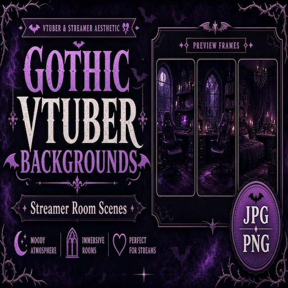
The Gothic Vtuber Room, Celestial Stream, Lofi Scrapbook Stream, and Neon Cyberpunk OBS packs are all currently described as four 1920×1080 landscape JPG backgrounds with four matching PNG exports. Their titles point to different visual directions, while the direct previews show the actual rooms, screens, and open areas. Compare them using the same camera, avatar, game, and text map so style is the only major variable.
The Neutral Product Mockup Backgrounds pack uses the same listed landscape dimensions and JPG/PNG package pattern, but its title and description center on flat-lay and product-presentation visuals. It may suit a creator or small brand whose main foreground is a product, offer, or demonstration rather than a character-led room. Verify the previews against that exact layout instead of assuming “neutral” automatically means empty or distraction-free.
Do not buy several packs to solve a layout problem that appears in all of them. First identify whether the missing quality is open camera space, a calmer text zone, a darker or lighter mood, or a product-focused surface. Then compare the four previews in the closest pack. If none can hold your real sources cleanly, skip the purchase and look for a different composition or a more complete overlay system.
- Gothic, celestial, lofi, and neon packs share the same listed 1920×1080 JPG/PNG package pattern.
- Use the neutral pack when its actual product-presentation compositions fit the foreground job.
- Compare every candidate with the same source map.
- Skip a pack when the previews do not leave usable space for your real scene.
Complete a final file-fit check before opening Etsy
Before checkout, confirm that a static landscape image is what you need. Check the current listing for four finished 1920×1080 JPG backgrounds, four PNG exports of the same backgrounds, and a README/license note. Review the landscape previews, identify the scene you would use first, and make sure your device can download and organize the files. These are digital assets only; no physical room set, printed backdrop, hardware, setup service, or custom scene is shipped.
Confirm what is not listed as carefully as what is. The featured static packages do not describe MP4 animation, alert widgets, webcam frames, transitions, audio, editable layered source files, or custom revisions as included items. If any of those is essential, verify the current package before buying or choose a tool designed for that missing job. Do not infer an extra feature from a styled mockup, file extension, or related-product link.
Finally, check the included license note for your planned personal, business, channel, or client use and retain it with the original download. Make a simple scene sketch with the background, camera or avatar, main content, and longest text line. If the preview can support that sketch without hiding its best details or reducing legibility, the pack is a practical candidate. If not, keep looking—the right background should make the scene easier to understand, not merely more decorated.
- I need a static 16:9 background rather than a vertical file or animated loop.
- I checked the current direct previews and the listed 1920×1080 JPG and PNG package.
- I know which foreground sources and text must fit over the image.
- I verified any essential feature that is not clearly shown or listed.
- I reviewed the license and understand that this is a digital download, not a physical or custom setup.
Printables used in this guide
Instant downloads from the SteadyStackStudio Etsy shop.
Gothic Vtuber Room Background
Gothic Vtuber Room Backgrounds is a polished digital background pack for creators, streamers, social media managers, and small…
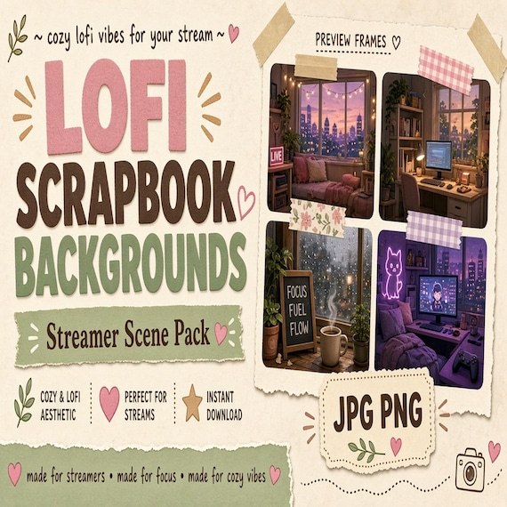
Lofi Vtuber Background Pack
Lofi Scrapbook Stream Backgrounds is a polished digital background pack for creators, streamers, social media managers, and small…
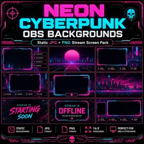
Neon Cyberpunk Vtuber Background
Neon Cyberpunk OBS Backgrounds is a polished digital background pack for creators, streamers, social media managers, and small…
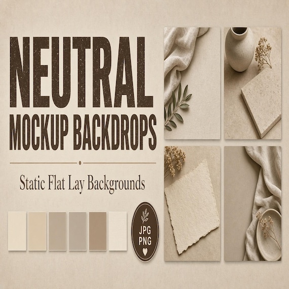
Neutral Product Mockup Backgrounds
Neutral Product Mockup Backgrounds is a set of neutral flat lay backdrops for small shops and product sellers who want clean…