Digital Art & Coloring · Jul 17, 2026 · 11 min read
How to Use 9:16 Static Backgrounds for Reels, Shorts, and Stories
A practical workflow for turning vertical JPG and PNG backgrounds into readable story graphics, product features, and short-form videos without mistaking still files for MP4 clips.
Know what the current download is—and what it is not
The current Vertical Social Backgrounds listing describes four finished 1080 × 1920 vertical designs supplied as four JPG files and four PNG exports of the same designs, plus a README and license note. The 1080 × 1920 shape is a 9:16 portrait canvas, which makes it a practical starting size for phone-first layouts. Check the current product page and downloaded README before beginning because contents and terms can change.
These are static image files. They are not finished videos, moving overlays, editable scene templates, or MP4 loops. A still background can become part of a Reel or Short when you place it on a video timeline and export a video from your editor, but the source image itself does not move. That distinction is the first fit check: buy a static pack when you need a designed visual base, not when you need motion already built into the file.
- Use the JPG or PNG as a finished visual base for your own layout.
- Do not expect text, logos, products, captions, music, or animation to be prebuilt.
- Keep the README with the files so usage terms remain easy to find.
- Choose a video product instead only when the current listing explicitly includes a motion format you need.
Choose the finished post before choosing the background
A vertical background works best when it is selected for a specific finished post. Decide whether you are making a single story graphic, a cover, a text-led short video, a product feature, a quote card, an announcement, or a sequence of several slides. Each job needs a different amount of quiet space, contrast, and room for other elements.
Write the one action the viewer should take after seeing the post. That might be reading a tip, noticing a product detail, remembering a date, visiting a link, or continuing to the next slide. Then choose the design whose open areas support that action. A visually dramatic background may be the wrong choice when it competes with the headline, while a calmer design can make a simple message easier to understand on a small screen.
- For a story graphic, plan one clear message that can be understood without sound.
- For a cover, prioritize a short readable title and an image that still makes sense when cropped.
- For a product feature, reserve enough open space for the product rather than covering the most detailed part of the art.
- For a multi-slide sequence, choose backgrounds that feel related without making every slide identical.
Preserve the originals and make a project copy
Keep the downloaded folder unchanged. Create a working folder for the campaign, event, product, or week, then copy only the background files you plan to use into it. This protects the originals from accidental cropping, compression, or overwriting and gives you a clean source when a draft goes in the wrong direction.
Name each working file by job instead of leaving several copies called final. A simple pattern such as project-purpose-version is enough: summer-sale-cover-v01 or launch-tip-slide-02-v02. Keep editable drafts separate from exported JPG, PNG, or video files. When a post is approved, place the exact uploaded version in an approved folder so the next edit begins from the working file rather than a compressed social download.
- Originals: untouched download, README, and license note.
- Working: editable layouts and copied background files.
- Exports: files created for review or posting.
- Approved: the exact version selected for use.
Use JPG and PNG deliberately
The current pack supplies JPG and PNG exports of the same finished backgrounds. Start with the version your editor opens reliably and compare the result at normal phone size. JPG is widely compatible and often convenient for a full-frame background. PNG can also preserve a finished image cleanly, but the PNG file extension alone does not mean the background is transparent or that every element is separately editable.
Do not convert files repeatedly before you start. Each extra save can add confusion or compression without improving the design. If a platform or editor changes the appearance, return to the untouched source, confirm the document is still 9:16, and make one controlled export. Keep logos, product cutouts, portraits, and text as separate layers in the working layout whenever your editor supports layers; the background should remain the bottom visual layer.
- Use the supplied file directly when it already works in your chosen editor.
- Inspect a PNG before assuming it contains transparent areas.
- Avoid enlarging a small preview or screenshot when the full downloaded file is available.
- Preserve separate working layers until the design is approved.
Place the background without stretching the design
Create a portrait 9:16 project and place the full-size vertical background into it. If the project already matches the background, it should fill the canvas without being pulled wider or taller. Dragging only one side can distort circles, frames, furniture, patterns, and other recognizable details. Scale proportionally, and crop only when the finished platform preview requires it.
Some apps show a full 9:16 upload differently in a profile grid, feed preview, thumbnail, or editing screen. Treat the full vertical canvas as the master, then preview the actual destination before posting. Keep essential words, faces, logos, prices, and calls to action away from the outer edges and from areas commonly covered by interface controls. Because those controls can change, a live preview is more reliable than memorizing one permanent set of margins.
- Scale from a corner or use a locked aspect ratio so the art stays proportional.
- Move the image within the frame rather than squeezing it to reveal more content.
- Keep essential information in a comfortable central reading area.
- Check the cover, feed, or profile preview separately from the full-screen post.
Build a text-led layout that remains readable
For a tip, quote, announcement, or list, start with one short headline and one supporting line. Place the headline over the quietest part of the background and test it at the size a viewer will actually see. If the art behind the words is busy, move the text, shorten it, or add a restrained solid or softly shaded text panel. Do not solve every contrast problem with more outlines, shadows, and decorative fonts.
Use a clear hierarchy: headline first, supporting detail second, action last. A viewer should not have to decide whether the artwork, title, caption, logo, and button are all equally important. Keep type styles consistent across a series and leave enough space between lines for small-screen reading. If the post only makes sense after reading a long caption, the visual should still communicate its basic subject and next step on its own.
- Read the design once at full editing size and again as a small phone preview.
- Use fewer words when the background has strong visual detail.
- Check contrast on both bright and dim screens when practical.
- Keep decorative type for accents rather than essential instructions.
Build a product or portrait feature without hiding the subject
A background can frame a product, portrait, book, screenshot, or other focal image, but it does not automatically create a realistic mockup. Use a properly prepared image that you have permission to use, and remove its background only when your editing workflow can create a clean edge. Place the subject where it feels supported by the scene rather than floating over important details.
Check the scale and lighting relationship. A product cutout that is much sharper, brighter, or differently lit than the background may look disconnected. A subtle shadow can sometimes establish separation, but it should not hide an uneven cutout. For screenshots or page previews, use a simple frame with readable content and avoid implying that a device, physical product, or app feature is included when it is only part of your finished promotional layout.
- Use your own authorized product, portrait, cover, or screenshot image.
- Keep the main subject clear of captions and interface-covered edges.
- Inspect hair, hands, product edges, and transparent areas at normal viewing size.
- Label promotional mockups clearly when the pictured device or setting is not included.
Turn the still background into a short video only when motion helps
To use a static background in a short-form video, place the image on a 9:16 video timeline and set how long it should remain visible. Add your text, product image, photo, or video layer above it. If movement supports the message, use one gentle zoom, pan, fade, or transition rather than several competing effects. The editing app creates the motion and the final video export; the original JPG or PNG remains a still image.
Plan timing around comprehension. Give the first frame enough time to establish the subject, keep each message visible long enough to read, and avoid placing essential information only in a fast transition. Music, narration, or sound effects may add context, but the design should still work for someone watching silently. Add captions for spoken content in the editing or posting workflow and review their placement against the background before export.
- Set the still image duration before timing text and transitions.
- Use simple movement that supports attention instead of distracting from the message.
- Keep captions readable and away from competing artwork or interface controls.
- Export a video only after the full timeline has been previewed from beginning to end.
Create a useful three-post system from one visual direction
A small static pack is easier to use when each design has an assigned role. Build a simple three-post system: one education post, one product or service feature, and one action post. The education post can lead with a tip or short list. The feature can show a product, example, event, or result. The action post can announce availability, a date, a link destination, or the next step. This creates variety without forcing every background to carry every kind of message.
Save the text placement, font choices, logo position, and spacing as a working style reference, not as a promise that every background should use the exact same layout. Adjust for the open space in each design. If the series will be used across Stories, Reels, and Shorts, make one clean master for each message, then inspect each destination separately instead of assuming one upload will crop and display identically everywhere.
- Education: one clear idea that is useful without a sales message.
- Feature: one product, service, book, event, or example as the focal point.
- Action: one specific next step with accurate details.
- Review: compare the three posts together for readability and visual variety.
Export once, then inspect the real file
Before exporting, remove hidden drafts, placeholder text, guide marks, and unused layers that could appear unexpectedly. Confirm spelling, dates, prices, names, links, and any disclosure the finished post needs. Export from the working master at the intended vertical size rather than taking a screenshot of the editor. If the final deliverable is a video, inspect the beginning and end for unwanted blank frames and confirm that every layer remains visible for the planned duration.
Open the exported file outside the editor and view it on a phone. Check sharpness, color, text size, crop, caption area, and whether the first frame explains the subject. Then use the destination app's preview before posting. If something is cut off or difficult to read, revise the working master and export again; do not keep resizing the already compressed upload copy.
- Open the exported image or video as a viewer would, not only inside the editor.
- Check the first frame, final frame, crop, and small-screen text.
- Confirm the post still makes sense with the sound muted.
- Keep the approved export and editable master as separate files.
Run a final rights and accuracy check
The current listing allows use according to its included README and does not allow the original download files to be shared, redistributed, or resold as a competing asset pack. Keep the source files private and use them inside your own finished work as the current terms permit. Review the README again when a project involves client work, products for sale, paid advertising, or another use that may need a closer license check.
Also review every element you add. A purchased background does not grant rights to a logo, song, font, portrait, product photo, screenshot, quotation, or trademark added later. Use authorized materials, follow the current rules of the destination platform, and make only claims you can support. When a design promotes a date, price, feature, or availability, compare the final export with the current source information immediately before posting.
- Follow the README that accompanies the current download.
- Do not distribute the raw JPG or PNG files to customers or collaborators who are not covered by the terms.
- Confirm rights for every added image, font, audio track, logo, and quotation.
- Recheck changing details such as dates, links, prices, and availability before upload.
Decide whether a static 9:16 pack fits the job
Choose this type of pack when you want a ready-made vertical visual base and are comfortable adding your own message or subject in an image or video editor. It is especially useful for text-led graphics, story slides, covers, announcements, simple product features, and short videos where the motion will be added during editing. The current four-design pack is a focused choice when a small coordinated set is more useful than a large mixed library.
Choose something else when you need an editable scene with separate artwork layers, a transparent cutout collection, a landscape stream screen, a custom brand design, or motion already supplied as video. The related static background pages include different orientations and visual directions, so compare the product title, preview, dimensions, file types, and current description before checkout. The best fit is the file you can place into a real project immediately without inventing capabilities the download does not claim.
- Good fit: a vertical still-image base for your own text, photo, product, or timeline.
- Pause: you need editable layers, built-in animation, custom sizing, or a format not shown.
- Compare: orientation, dimensions, visual style, file types, license, and the number of distinct designs.
- Before Etsy checkout, open the current product preview and confirm the pack matches the exact finished post you plan to make.
Printables used in this guide
Instant downloads from the SteadyStackStudio Etsy shop.
Lofi Vtuber Background Pack
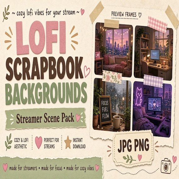
Lofi Scrapbook Stream Backgrounds is a polished digital background pack for creators, streamers, social media managers, and small…
Gothic Vtuber Room Background
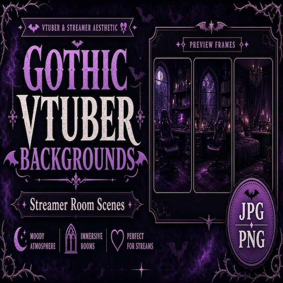
Gothic Vtuber Room Backgrounds is a polished digital background pack for creators, streamers, social media managers, and small…
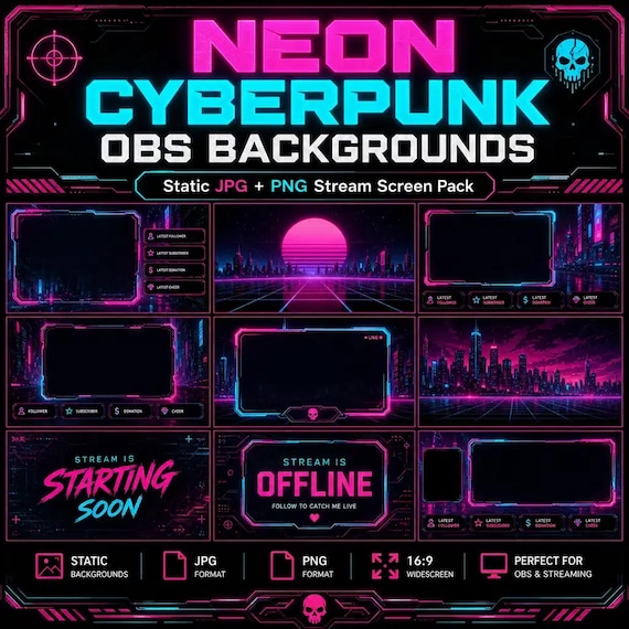
Neon Cyberpunk Vtuber Background
Neon Cyberpunk OBS Backgrounds is a polished digital background pack for creators, streamers, social media managers, and small…
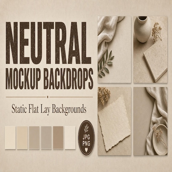
Neutral Product Mockup Backgrounds
Neutral Product Mockup Backgrounds is a set of neutral flat lay backdrops for small shops and product sellers who want clean…