Digital Art & Coloring · Oct 3, 2026 · 12 min read
Retro Groovy or Boho Digital Paper: Test One Pattern JPG Before You Print or Post
A practical file check for paper crafters, scrapbookers, and small brands who need a pattern background rather than journal pages or a stream scene. Confirm the 12 JPG files and README, choose a groovy or neutral palette for the piece in front of you, then test one file at print size and in the real screen crop.
Name the finished piece before you open a preview
A pattern pack is useful only when you can name the piece it has to support. Write one sentence first: this is a printed scrapbook background, a card front, a journal cover lining, a square social post, or a wide promo layout. If you cannot finish that sentence, you are shopping for a mood, not preparing a file.
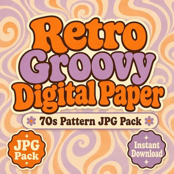
The Retro Groovy Digital Paper Pack and the Boho Digital Paper Pack are both sets of individual JPG pattern files plus a short README. They are background paper, not a kit of tags, tickets, and pockets. Open the groovy pack when the piece should feel like 1970s pattern paper: bold, retro, and graphic. Open the boho pack when the same job needs a quieter neutral pattern. Those themes come from the current titles and tags. They are not a promise that every motif you can imagine is in the folder.
Do that note before you compare previews. A loud cover image can make either pack look like the right download. The finished piece decides. A pale invitation liner and a retro sticker sheet are not the same job, even if both can sit on patterned paper.
Confirm the file list before you assume extras
Open the current listing and read the included-file lines literally. Each of these two packs lists 12 individual JPG digital paper pattern and background files and a simple README and license note. That is the whole package. There is no PNG export, no combined printable PDF, no SVG, and no set of separate transparent cutouts.
That limit matters. A JPG background keeps its own backdrop. You cannot knock the pattern out to a clear sticker the way you can with a transparent PNG icon. If the job is a cut icon, a logo mark, or a sticker with a clear edge, stop here and use a clipart pack instead. If the job is a page of ephemera you will cut apart, these 12 files are the wrong shape.
Count the files after you unzip, not from memory of a similar download. Twelve JPGs means twelve backgrounds you can open one at a time. It does not mean twelve pages of a journal, and it does not mean one seamless swatch plus eleven variations unless you can see that in the files themselves.
Choose groovy or boho by the piece in front of you
Put the two packs side by side only after the job is named. The choice is a mood and a contrast problem, not a hunt for the busier thumbnail.
Ask whether the piece needs a 1970s graphic mood or a quieter neutral mood. Groovy paper will compete with delicate script and pale florals. Neutral boho paper can look flat behind a bold retro title. Match the pattern energy to the words and photos that have to stay readable.
Then ask whether this paper is the whole background or one layer among many. A full-bleed card can carry a busy groovy pattern if the type sits in a calmer area of the file. A scrapbook page that already has photos, a date, and a caption usually needs the quieter pack, or a crop of the groovy file that leaves a resting place for those photos.
Finally, decide whether you are making one test piece or a matched set. Both packs have 12 files, so you can keep a small family of patterns without mixing decades on one spread. Do not mix groovy and boho on the same page unless you have already printed one of each and the contrast still looks intentional. A preview collage is not that test.
Open one JPG and see whether it is paper or a page
Do not print all 12 files on the first afternoon. Open a single JPG in the app you will actually use: a photo editor, a layout program, or the print dialog. Look for a pattern or background that can sit behind other elements. Also look for the opposite: a composed journal page with tickets, labels, and frames meant to be cut out. These listings describe pattern and background files. If the file you opened looks like a page of ephemera, you have the wrong download, or you are looking at a preview of a different product.
Check the edges of that one file. A useful background still reads when you cover the center with a photo or a text box. If the only interesting part is a single motif in the middle, it may work as a card front and fail as paper behind a photo spread. Note what you see in one line: all-over pattern, corner motif, border, or a scene. Use that note when you skim the other files. Do not assume the other 11 match until you have glanced at them at a small size.
Save the test file under a project name and leave the original ZIP alone. A renamed copy is the file you may crop. The download you paid for should stay complete in case you need a fresh start.
Read the pixel size yourself
The current listings do not state pixel dimensions, print resolution, or a recommended paper size. That is not a hidden number you should guess. After you open the test JPG, read the width and height in your software and write them down. Then decide whether that file can cover the piece you named.
A file that looks sharp on a phone can turn soft when you stretch it across a 12-inch scrapbook page. A file that is larger than your card can still be the right paper if you crop it instead of shrinking the whole pattern into a tiny corner. The honest check is the size you will print or post, not the size of the shop thumbnail.
If your app shows a very small image, do not enlarge it and hope. Print or export one proof at the real size first. If the pattern breaks into blocks or the colors band, that file is the wrong scale for that piece. Choose a smaller finished size, or choose a different background product that states a size you can match.
Print one sheet before you print the set
Use the paper you will actually craft with. Cardstock, copy paper, and sticker paper do not hold color the same way. Set the print dialog to the real page size. Avoid a fit-to-page setting if it shrinks the pattern without showing you the new scale. Note the scale percentage next to the project name.
Print one page. Then check the sheet on the desk, not on the screen. Can you still see the pattern at arm's length, or did it turn into noise? Did the colors shift far enough that the groovy pack no longer looks like the preview, or the neutral pack picked up a cast you do not want next to photos? Do the margins cut off a border you were counting on? If the listing does not promise a border, do not plan the layout around one. Is the sheet flat enough to glue, or is the ink still soft? Wait before you judge a smear.
One good test page is enough to approve the printer settings. Then print only the files you will use this week. Keep the originals untouched and save the print settings with the project name so the next sheet matches the first.
- Pattern still readable at arm's length
- Color shift still acceptable next to your photos or type
- Margins did not remove a border you needed
- Ink dry enough to handle before you glue or cut
Crop the real screen frame before you post
These packs are also listed for creator backgrounds, social graphics, and promo layouts. A print test does not answer that job. Open the same JPG in a frame that matches the post: a square, a tall portrait, a vertical story, or a wide banner. Crop it. Do not shrink the whole file into a letterboxed box and call that a layout.
Put the real words on the crop. A short title, a price, or a date is enough. If you cannot find a place where the letters stay readable, the pattern is too busy for that frame. Move the crop, add a simple text panel you design yourself, or switch to the quieter pack. Do not outline the letters in three colors and hope the pattern disappears.
Check the crop on a phone, not only on a large monitor. Pattern that looks delicate on a desktop can strobe at story size. If the file is for a shop listing image or a pin, use that exact frame for the test. A pretty full-file preview is not the image your reader will see.
Do not assume the JPG tiles without a seam
The listings call these files pattern and background JPGs. They do not say the files are seamless tiles, and they do not include a vector pattern you can redefine. If you need the paper to repeat across a larger surface, test that yourself before you build the layout.
Place two copies of the same JPG edge to edge, first side by side and then one above the other. Look for a hard line, a sudden shift in color, or a motif that is cut in half. If you see a seam, do not scale the file up and pretend the seam will vanish. Use the file as a single background, crop inside the edges, or choose a different paper. A failed tile test is a useful result. It tells you the file is a finished background, not a swatch for an all-over print.
The same rule applies to a full wrap or a blank you plan to press. These downloads do not list wrap templates, bleed guides, or garment files. If that is the job, this pack is only a visual reference until you have tested scale, seam, and color on the blank you actually use.
Switch to a journal kit when the job is cutting pages
A journal page and a pattern background solve different afternoons. Scrapbook layouts are usually built around photos and coordinated paper. A junk journal is a layered book of mixed pages, tags, and ephemera, and the cutting is part of the craft. The file you buy should match that difference.
The shop's Western Cowgirl, Fairy Mushroom, and Gothic Lace journal downloads each include 4 finished printable journal or ephemera pages as JPG files, 1 combined printable PDF, and a README. Those are pages you can print and cut. The digital paper packs do not include that PDF, and they do not list ephemera pages.
Use the journal kit when you need tags, frames, collage pieces, or a page that already looks composed. Use the digital paper when you need a background behind photos, type, or those cut pieces. Printing a pattern JPG and then trying to scissor it into tickets will waste the sheet. Printing a journal page as a full-bleed background will bury the ephemera you bought the kit to use.
If you want both, keep them in separate folders and give each file one job. The junk journal print guide walks through paper, sizing, cutting, and assembly for page kits. This guide stops at the pattern test. Do not follow a cutting plan that belongs to a different file list.
Switch to a scene pack when the job is a wide screen
A stream or video background is another nearby file, and it is not this paper. The Celestial Stream Background Pack includes 4 finished 1920 by 1080 landscape JPG backgrounds and 4 PNG exports of those same backgrounds. That is a stated screen size you can match to a landscape scene. The digital paper listings do not state 1920 by 1080, and they do not include PNG copies.
If the job is a broadcast scene, a webcam frame, or a landscape screen with a clear area for a camera, start with a scene pack that states the pixel size. A pattern JPG can still sit behind a simple title card if your crop test passed. It is a weak choice for a full scene when you need a horizon, a desk, or a calm center. Do not stretch a scrapbook pattern into a wide screen and call it a set.
Book-cover background packs are a third job again. Those files are portrait art prepared for a cover ratio, not a 12-file pattern paper set. If the piece is a book cover, use a cover background and test title space there. Do not force a scrapbook pattern into a cover template just because both files are JPGs.
Read the license and the creative note before the file leaves your computer
Both paper packs say personal and small-commercial use are welcome for finished projects unless the included README says otherwise. They also say not to resell, share, or redistribute the original download files as-is. Read the README in the folder before you send a file to a printer, a designer, or a client. The listing summary is not a substitute for the note packed with the files.
The listings also say that some artwork was created with seller-directed assisted design tools, then selected, formatted, packaged, and checked. That is a fact about how the files were made. It is not a claim that every motif is a hand-drawn illustration, and it is not a reason to skip the print test. If a client or a platform needs a different note, handle that in your own project records. Do not delete the README and hope the question goes away.
Colors can vary by screen and printer. You are responsible for the final piece, including any words you place on the pattern. These files do not include your titles, your photos, or a finished cover.
Run the fit check, then choose one download
Use this list once, with the piece named at the top of the page. If a line fails, change the file or the plan before you print the rest of the pack.
The job is a pattern background for print, a card, a scrapbook layer, or a cropped social graphic. You do not need transparent cutouts, a combined PDF, or pages of ephemera. Groovy fits a 1970s graphic mood. Boho fits a quieter neutral mood. Buy both only when each pack has a real piece waiting, not because the previews are hard to tell apart on a phone.
You opened one JPG, read its pixel size, and either printed it at the real paper size or cropped it to the real post frame. Text or photos still have a readable place. If you needed a tile, the edge-to-edge test passed. If it failed, you will use the file as a single background. The README license matches the way you plan to use the finished piece.
If those lines are true, choose the pack that matched the mood and leave the other one closed. If the job is cut journal pages, use a journal kit. If the job is a sized wide scene, use a stream background that states its dimensions. A pattern JPG is a strong, simple file when you test one before you print or post the rest.
Printables used in this guide
Instant downloads from the SteadyStackStudio Etsy shop.
Retro Groovy Digital Paper Pack
Retro Groovy Digital Paper Pack is a polished digital background pack for creators, streamers, social media managers, and small…
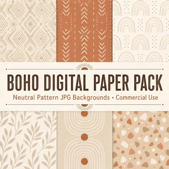
Boho Digital Paper Pack
Boho Digital Paper Pack is a polished digital background pack for creators, streamers, social media managers, and small brands…
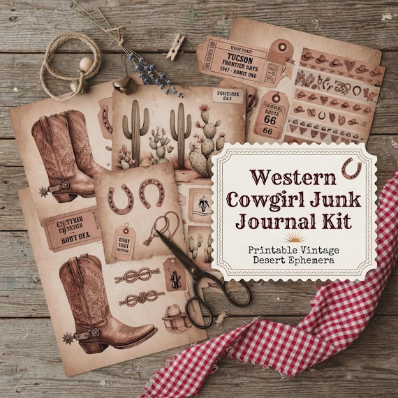
Western Junk Journal Kit Printable
Western Cowgirl Junk Journal Kit is a printable junk journal and ephemera download for scrapbookers, journal makers, collage…
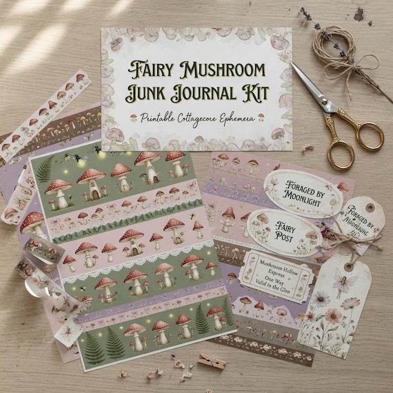
Fairy Mushroom Junk Journal Kit Printable
Fairy Mushroom Junk Journal Kit is a printable junk journal and ephemera download for scrapbookers, journal makers, collage…