Digital Art & Coloring · Jul 14, 2026 · 11 min read
How to Print a Junk Journal Kit: Paper, Sizing, Cutting, and Assembly
A practical start-to-finish guide for checking a printable junk journal download, testing paper and scale, planning page order, cutting ephemera, and assembling a usable journal without wasting the original files.
Confirm what the download includes before printing
A printable junk journal kit is easiest to use when you understand the files before sending a full set to the printer. Open the listing previews and read the current description closely. Check whether the download is presented as complete journal pages, smaller ephemera pieces, tags, pockets, decorative papers, or a mixture. Also confirm the stated file types, page dimensions, delivery method, and license. A beautiful cover image does not tell you whether the inside pieces fit the project you have in mind.
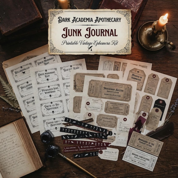
The featured dark academia apothecary kit is described as a digital set of printable vintage botanical ephemera pages with a README or license note. Use the current product page as the final source for the exact files. Before checkout, look for direct previews of the actual pages and decide whether the theme, amount of writing space, and balance of large and small pieces suit the journal you want to make. If an important detail is not shown, do not fill the gap with an assumption.
- Check the current file types and dimensions rather than assuming every printable kit uses the same format.
- Look for actual page previews, not only a styled mockup or cover.
- Decide whether you need full pages, background papers, pockets, tags, labels, or a combination.
- Read the included license note before planning any use beyond your own project.
Keep the original files and make a working copy
Treat the downloaded package as the clean master. Save it in a clearly named folder, keep the original filenames intact, and make a separate working copy before cropping, resizing, renaming, or combining anything. If the delivery is a ZIP archive, extract it once into the working folder instead of repeatedly opening files from inside the archive. This gives you a stable version to return to when a print setting or edit does not work as expected.
A simple folder structure is enough: one folder for the untouched download, one for pages prepared for printing, and one for test prints or notes. Add the theme and purchase date to the parent folder so it remains recognizable later. If you prepare several versions, label them by purpose, such as full page, half size, or tags, rather than calling them final, final two, and final latest. The goal is not elaborate file management; it is avoiding an accidental overwrite of the only clean copy.
- Preserve the original download exactly as received.
- Edit, crop, or resize only a duplicate in a separate working folder.
- Keep the README and license beside the artwork so they do not become separated.
- Record the print settings that worked instead of trying to remember them later.
Choose paper by the role each page will play
One paper does not need to handle every part of a junk journal. Pages meant for handwriting usually benefit from a surface that accepts the pen or pencil you plan to use. Decorative inserts can prioritize color and texture. Tags, pockets, and pieces that will be handled often may need more body than a page that will be folded into a signature. Before buying specialty paper, decide which pieces need to bend, which need to stay flat, and which will carry adhesive or extra layers.
Printer limits matter more than a generic paper recommendation. Check the printer manual for supported sizes, finishes, and thicknesses, then test the actual paper through the intended feed path. Heavier is not automatically better: a stiff sheet may crack at a fold, create a bulky spine, or fail to feed cleanly. Very thin paper may show printing from the other side or wrinkle under wet adhesive. Start with paper you already know your printer can handle, and change one variable at a time.
- Use the intended writing tool on a sample before printing every journal page.
- Test how the sheet folds and whether the printed surface scuffs at the crease.
- Reserve sturdier stock for pieces that need structure rather than making the whole journal bulky.
- Follow the printer maker’s paper guidance and use a compatible feed path.
Run one representative test print first
A single test page can answer most of the expensive questions. Choose a page with light and dark areas, fine details, an edge treatment, and at least one small piece if the kit includes ephemera. Print it with the paper, software, printer, and quality setting you expect to use. Let the page settle before judging it, then compare the result with the screen without expecting them to match perfectly. Screens emit light; paper reflects it, and the printer, ink, paper finish, and settings all affect the result.
Inspect the test under the light where the journal will normally be used. Check whether dark artwork has lost detail, pale lines remain visible, text or labels are readable, and the image sits inside the printable area. Fold one section and cut one small piece. If you plan to write on the page, test the intended pen and allow it to dry. Make adjustments only after identifying the specific problem. Changing paper, scale, color settings, and print quality at the same time makes it difficult to know what helped.
- Use a page that represents the darkest, lightest, and smallest details in the kit.
- Check margins, readability, folding, cutting, and writing on the same test.
- Save the successful paper and print settings with the working files.
- Print the full set only after the representative page performs the way you need.
Use scale settings deliberately
Print dialogs often offer choices such as actual size, fit, shrink oversized pages, or a custom percentage. Those options solve different problems. Actual size keeps the file at its designed dimensions when the printer and paper can accommodate it. Fit changes the scale so the artwork stays inside the printable area. A custom percentage can help create smaller inserts, but it also changes writing space, label size, borders, and the relationship between pieces. Do not select a setting simply because it prevents a warning.
Measure one known element on the test page and write down the chosen setting. If you want a smaller journal, test the reduction before preparing every file. Fine lines and tiny labels may become difficult to cut or read even when the overall page still looks attractive. If a border is important, make sure the printer is not trimming it. If the design reaches the edge, confirm whether your printer supports borderless output; otherwise accept a margin or plan a deliberate trim instead of expecting ink outside the printable area.
- Choose actual size when designed dimensions matter and the full page fits the available paper.
- Use fit only after checking how much the software changes the scale.
- Test any custom reduction on the smallest labels, lines, and writing areas.
- Do not assume every home printer can print to the physical edge of the sheet.
Plan the page order before cutting everything
A pile of attractive prints does not automatically become a comfortable journal. Decide on the finished size, approximate number of pages, and broad rhythm before cutting the entire kit. Lay the prints on a table or use inexpensive blank paper to mock up the sequence. Alternate visually busy pages with quieter writing areas, and distribute pockets, tags, and heavier pieces so one section does not become much thicker than the rest.
If you plan to print on both sides, run a separate orientation test. Printers differ in how they flip a sheet, and the correct choice can change between portrait and landscape files. Mark a test sheet with top, bottom, front, and back, then print one side and return it through the feed path. Check that both sides are upright and that heavy artwork does not make writing difficult. A kit does not need to be printed duplex to be useful; blank backs, separate writing pages, and single-sided decorative sheets can all be intentional choices.
- Choose the finished page size before trimming the decorative sheets.
- Spread pockets, tags, and layered pieces across the journal instead of clustering them.
- Use a marked test sheet before attempting two-sided printing.
- Leave room for blank or lightly decorated pages when the journal should support writing.
Cut, fold, and layer in small batches
Prepare a few pages at a time so an early decision does not lock the entire project into the wrong size or order. Start with straight outside edges, then move to smaller tags and irregular pieces. Use the cutting method you can control safely on a protected surface. A ruler and craft knife, a paper trimmer, and scissors produce different results; the best choice is the one that fits the shape and your comfort level. Keep hands clear of blades and replace dull tools rather than forcing a cut.
Score or pre-crease folds gently when the paper needs help bending cleanly, especially across a printed area or on sturdier stock. Test adhesive on scraps from the same paper because some products can wrinkle thin sheets, show through pale artwork, or remain visible at an edge. Add one pocket or layered cluster, close the journal, and check the bulk before repeating it. Small batches make it easier to correct a trim, fold direction, or adhesive choice without sacrificing every printed page.
- Cut one complete sample piece before trimming all matching pieces.
- Use a protected work surface and tools suited to the shape and your experience.
- Test folds and adhesive on scraps from the actual printed paper.
- Close and handle the journal after each layered group to monitor bulk and movement.
Add writing space without hiding the artwork
Junk journal pages can be decorative and still remain usable. Decide where a person will write, tuck a note, attach a photo, or add a date before covering the page with extra pieces. Busy botanical or apothecary artwork can become a frame for a quieter label, a folded writing card, or a pocket that opens to blank space. The aim is not to fill every empty area. Leaving visual breathing room makes the page easier to revisit and gives later additions somewhere to belong.
Test writing surfaces before assembly. Ink that works on plain paper may smear on a coated or heavily printed area. If the back of a decorative piece is easier to write on, keep it accessible rather than gluing down the entire surface. Avoid placing thick layers directly opposite each other when the journal needs to close comfortably. When adding personal photographs, old papers, or found materials, use copies when the original has sentimental or archival value and choose methods appropriate to the item.
- Assign a practical role to each pocket, tag, card, or decorative cluster.
- Keep some quiet areas for handwriting, dates, captions, or later additions.
- Test pens on printed and unprinted surfaces before attaching the piece.
- Avoid permanently altering irreplaceable originals for a first experiment.
Organize leftover pieces for the next spread
Printable kits often leave useful offcuts, alternate pieces, and pages that did not fit the first plan. Sort them before clearing the work surface. A small envelope or folder for tags, labels, borders, and larger page remnants keeps the theme together and prevents duplicate printing. Note which scale and paper produced each piece if several tests look similar. Scraps can become tabs, narrow writing strips, small collage layers, or practice material for a new adhesive or pen.
Keep only leftovers that are large enough or clear enough to use. Saving every sliver makes the next project harder to start. Store the printed pieces with a reference to the original digital kit so you can check the license or print a matching page later. If a page failed because of a setting rather than the artwork, mark it as a test before putting it away. A small, labeled remainder pack is more useful than a mixed box of unidentifiable images.
- Separate tags, labels, page remnants, and true waste while the project is still fresh.
- Label test prints so they are not mistaken for the approved version.
- Keep the theme name and original file folder easy to reconnect.
- Discard pieces that are unreadable, damaged, or too small to use safely.
Check the license before using pages in finished work
The current featured listing describes single-buyer or single-business use, allows the finished assets to be used in the buyer’s own projects under the included terms, and prohibits reselling, redistributing, sharing, or claiming the raw digital files as a competing download pack. The README and current listing remain the controlling description of what is allowed. Save both with the original files and read them before giving away, selling, teaching with, or reproducing anything made from the kit.
Do not assume that permission to make a personal journal automatically covers printed page packs, group distribution, classroom copies, client files, or products for sale. Those uses can be treated differently. If you want to sell a finished handmade journal, include kit pages in a client project, or make multiple copies, confirm that the exact use fits the current terms before investing in materials. A license for finished projects is not permission to upload the source files, offer editable copies, or sell substantially unchanged printed sheets as another supply pack.
- Keep the current README and purchase record with the master download.
- Confirm the exact planned use instead of relying on a broad commercial-use label.
- Never share or resell the raw files or a lightly repackaged version of them.
- Ask the seller before proceeding when the intended use is not clearly covered.
Compare the theme and file details before checkout
Choose the kit that matches the project, not simply the largest collection. The dark academia apothecary set is the strongest match when vintage botanical and moody journal imagery fits the intended pages. The related western cowgirl, fairy mushroom, and gothic lace sets offer different visual directions. Retro groovy and neutral boho digital papers may be useful when the main need is a repeatable background rather than a themed journal-page collection. Open each product page and compare what the current previews actually show.
Before leaving SteadyStackStudio for Etsy, confirm the title, price, file details, preview images, license, and delivery description all support the journal you plan to make. Check one real constraint: printer paper size, preferred finished journal size, writing needs, or intended finished use. Then choose the smallest complete download that satisfies it. A good printable kit should make the first test page and first assembled spread easier to plan, not require you to guess what is inside or buy several overlapping themes.
- Choose a themed kit when coordinated pages and ephemera are the main need.
- Choose digital paper when repeatable backgrounds are more important than a full page sequence.
- Compare direct page previews, not only theme names and cover art.
- Skip the purchase when the current listing does not answer the file, size, or license question that matters to your project.
Printables used in this guide
Instant downloads from the SteadyStackStudio Etsy shop.
Dark Academia Junk Journal Kit Printable
Dark Academia Apothecary Junk Journal Kit is a printable decorative ephemera download for junk journal makers, scrapbookers…
Western Junk Journal Kit Printable
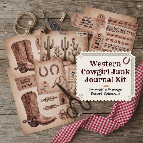
Western Cowgirl Junk Journal Kit is a printable junk journal and ephemera download for scrapbookers, journal makers, collage…
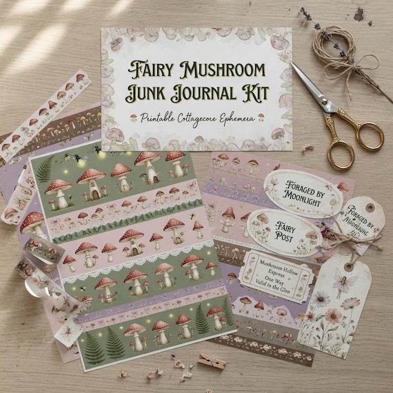
Fairy Mushroom Junk Journal Kit Printable
Fairy Mushroom Junk Journal Kit is a printable junk journal and ephemera download for scrapbookers, journal makers, collage…
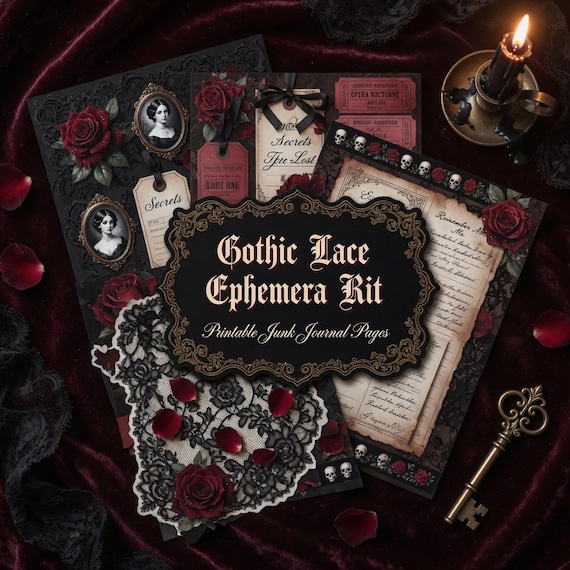
Gothic Junk Journal Kit Printable
Gothic Lace Ephemera Kit is a printable junk journal and ephemera download for scrapbookers, journal makers, collage artists…