Digital Art & Coloring · Aug 10, 2026 · 11 min read
How to Choose a Book Cover Background: Genre, Crop, Title Space, and Thumbnail Test
A practical guide to comparing portrait JPG background art, testing title placement and cropping, and deciding whether a background pack fits a cover concept or author-promo workflow.
Start by separating a background from a finished cover
A book-cover background is the artwork underneath the title, author name, series line, and any other cover text. It can give a design its setting and mood, but it is not automatically a complete, publication-ready cover. Before choosing a pack, check whether the listing offers flattened background images, editable layered files, a typography layout, or a finished cover service. Those are different purchases.
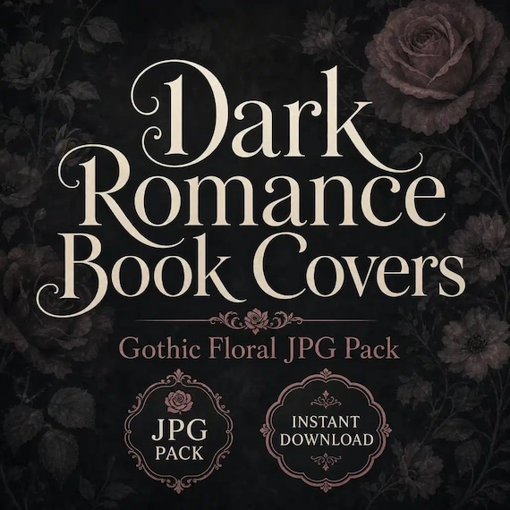
The featured dark-romance pack is described as portrait JPG background artwork for cover concepts, promotional graphics, mood boards, launch visuals, and similar design projects. That makes it useful when you want finished artwork to build on. You still need to place and license any fonts, create the final text hierarchy, and prepare the output required by the platform or printer you plan to use.
This distinction prevents the most common fit problem: buying art that has the right mood, then discovering that the missing layout, spine, back cover, or editable layers were the parts you expected the download to supply.
- Choose a background pack when you are comfortable adding and testing your own cover text.
- Choose a different product or service if you need a finished title treatment, a full paperback wrap, editable layers, or custom illustration.
- Treat mockups and styled listing images as previews; read the included-file list for the actual deliverables.
Name the final job before comparing artwork
Decide where the image must work before deciding which artwork looks best. An ebook front cover, a paperback front-cover concept, a full print wrap, a square announcement, and a vertical social teaser all use space differently. One background may support several of those jobs after careful cropping, but no single portrait image should be assumed to fit every output without adjustment.
Write down the first required deliverable and the system that will receive it. If the goal is an ebook front cover, collect that platform's current size and file rules. If the goal is print, obtain the current trim, bleed, spine, and wrap template for the exact book specifications. If the goal is promotion, list the shapes you need and decide whether the art can be cropped without cutting away its focal point.
Use the pack for the job it clearly supports now. Do not buy it only because you might someday need an unspecified cover size or campaign format.
- Primary job: ebook front, print-cover concept, full wrap, mood board, launch graphic, or social teaser
- Required shape: portrait, square, landscape, or a set of several crops
- Required components: front only, or front plus spine and back
- Required software and export format for the final handoff
Read the included-file list literally
The current dark-romance listing says it includes four finished portrait JPG backgrounds cropped to a 2:3 book-cover ratio, four original portrait JPG versions of the same finished artworks, and a README/license note. That is a clear file set: eight JPG files representing four artworks in two portrait treatments, plus the written usage information. It does not describe a layered Photoshop file, transparent PNG, editable title text, font package, or completed print wrap.
Keep the two versions of each artwork paired when you review them. The prepared 2:3 crop may give you a fast starting point, while the original portrait version may leave different room for a platform-specific crop or promotional layout. Compare both before adding text. A crop that looks strongest as art may not be the version that leaves the clearest title area.
After download, preserve an untouched copy of every original file and the README. Make separate working copies for experiments so a promising crop or color adjustment never replaces the delivered source.
- JPG is a flattened image format; do not expect movable artwork layers unless the listing explicitly includes them.
- A 2:3 crop is a starting shape, not proof that it matches every ebook or print specification.
- The included README is part of the purchase because it carries the current usage terms.
Compare genre mood before decorative details
A useful cover background should communicate the broad reading experience before someone studies the details. Reduce each candidate to a small preview and ask what it suggests without the title. Gothic florals can support a dark-romance direction; libraries and scholarly interiors can lean toward dark academia; a shadowed city can point toward suspense; an occult forest can suggest witchy paranormal fiction; a small-town café can support a cozy mystery; and futuristic space imagery can signal science fiction. The exact promise still comes from the complete design and the book itself.
Compare two or three nearby packs rather than forcing the first attractive image into the wrong genre. Focus on mood, setting, visual weight, and the location of the focal point. Decorative similarity is not enough. A cover can be beautifully dark yet still communicate fantasy, thriller, paranormal, or romance differently once it is seen beside competing books and at a small size.
Make a one-line mood brief for the project before choosing: for example, romantic but ominous, academic and secretive, tense and urban, or warm with a hint of mystery. Reject backgrounds that contradict the brief even if you like the artwork on its own.
Check title space before you commit to the image
Place temporary text on a working copy before making a final choice. Use the real title length, author name, and any essential series line rather than a short placeholder. A background with an important face, flower, doorway, symbol, or skyline in the center may leave less usable type space than the preview first suggests.
Test at least two title positions. Look for an area where the words can stay readable without covering the main subject or relying on an extreme shadow, glow, or outline. Check contrast across every letter; a title that crosses both a bright highlight and a dark shadow may become uneven even when the overall image looks dramatic.
Keep the hierarchy simple during this test. The title should read first, the author name should remain visible, and small supporting text should not become a patch used to fill empty space. If the artwork only works after shrinking the title below a readable size, choose another crop or another background.
- Use the actual title and author-name lengths.
- Protect the focal point instead of placing text over it by default.
- Check contrast letter by letter, not only across the whole text box.
- Test the title without assuming a specific font is included with the artwork.
Crop with the destination template, not by eye
Open a fresh working copy inside a canvas based on the current requirements for the final destination. Scale and position the image while keeping its proportions intact. Avoid stretching a portrait JPG to fill a shape, because distortion can make florals, architecture, figures, and typography alignment look wrong even when the change seems small.
For a front cover, mark any required edge allowance and keep essential artwork and text away from areas that may be trimmed. For a print wrap, use the printer's current template for the exact trim, page count, paper choice, and other requested specifications. A front-cover background does not automatically create a usable spine or back cover, so decide how those areas will be designed before treating the front as final.
If the crop removes the visual subject, leaves no title room, or requires enlarging the file beyond what your chosen output can support, return to the original portrait version or choose another artwork. Do not invent missing image area by stretching the edges.
Run a three-view thumbnail test
Review the draft at three practical views: large enough to inspect the artwork, medium enough to resemble a browsing card, and small enough to resemble a compact mobile thumbnail. You do not need to guess exact storefront dimensions for this comparison. The purpose is to see what survives as the design gets smaller.
At the large view, check crop quality, accidental tangencies, text spacing, and whether the image has been distorted. At the medium view, check title hierarchy and genre mood. At the smallest view, ask whether the title remains recognizable and whether one clear visual idea survives. Fine floral detail can add richness at full size while becoming texture at thumbnail size; that is acceptable when the title and main silhouette still carry the cover.
Place the draft beside two alternative backgrounds using the same temporary typography. This controls the comparison. If one design only looks stronger because its title is larger or its contrast treatment is heavier, correct the type before deciding which artwork performs best.
- Large: inspect crop, edges, spacing, and image quality.
- Medium: confirm title hierarchy and the intended genre mood.
- Small: look for one clear visual idea and a recognizable title shape.
- Compare alternatives with the same temporary text treatment.
Keep the editing workflow non-destructive
Create a project folder with the untouched download, working files, proofs, and final exports separated. Give each draft a useful name that includes the artwork choice and version rather than overwriting a file called final. If your design software supports layers, keep the background, title, author name, and supporting text on separate layers in your working document even though the delivered JPG itself is flattened.
Avoid repeatedly opening and resaving the same JPG as your only master. Work from a copy, save the editable project in the software's native format, and export a fresh review file when needed. This preserves a clean path back to the delivered art and makes title or crop changes easier later.
When you approve a version, record which source image and crop you used. That small note matters if you later need a corrected subtitle, a second promotional shape, or a coordinated series design.
- Untouched files: delivered JPGs and README
- Working files: editable layout with separate text elements
- Proofs: review copies for screen or print checks
- Final exports: files made to the current destination requirements
Proof the use you actually plan to make
For a digital cover or promo graphic, inspect the export on more than one screen and at the sizes people are likely to encounter. Look for muddy shadows, clipped text, weak contrast, and details that disappear after compression or resizing. Keep important decisions based on the exported file, not only on the sharper view inside the editor.
For a printed use, order or make the appropriate proof through the workflow you plan to use. Screens emit light; paper, ink, finish, and print settings can change dark areas and subtle color transitions. A home test print can reveal broad spacing problems, but it does not guarantee the result from a commercial printer. Follow that printer's current file and proof instructions.
For a launch graphic or social teaser, create the intended crop from the approved working file rather than stretching the final cover into every shape. Keep the title treatment consistent, but let the artwork reposition when a square or wide canvas needs a different balance.
Check rights, software, and missing pieces before checkout
The featured pack's current usage note welcomes personal and small-commercial use for finished projects unless the included README says otherwise, and it says not to resell, share, or redistribute the original files as-is. Read the delivered README before using the artwork, because that is where the current terms and any more specific limits belong. Do not assume that buying a background transfers ownership of the raw artwork or allows repackaging it as another asset download.
Confirm that your software can import JPG files, place text, crop without stretching, and export the format your destination requires. Confirm separately that you have permission to use the fonts, logos, and any other assets you add. A background-art license does not supply rights for unrelated typefaces or graphics.
Finally, list what is not included but still required. That may be typography, an editable layout, a spine and back cover, a printer template, platform setup, proofreading, or a professional cover review. The pack is a good fit only when you are prepared to supply or obtain those missing pieces.
Know when a background pack is the wrong starting point
Skip a JPG background pack when the project requires custom characters, a precisely described scene, editable artwork layers, a finished wraparound layout, or a design service that places and revises all text for you. A ready-made art pack is strongest when one of the included images already fits the mood and you have a clear plan for the remaining cover work.
It may also be the wrong fit when your required output dimensions, resolution, color instructions, or file type cannot be confirmed from the listing and previews. Ask before purchase rather than assuming that a portrait image can be enlarged, recolored, or converted for every print process.
Choose the smallest pack that provides a background you can genuinely use. Extra genres do not improve the project if only one mood matches the book.
- Good fit: an included portrait artwork matches the genre and leaves workable title space.
- Needs another solution: the brief requires custom art, movable image layers, or a completed cover service.
- Pause and verify: an essential size, file, license, software, or print requirement is not shown.
Run this final fit check before opening Etsy
First, confirm that you want background artwork rather than a finished cover. Review the featured product's actual file list: four finished portrait JPG backgrounds in a 2:3 crop, four original portrait JPG versions of those artworks, and the README/license note. Make sure JPG files and a self-directed layout workflow match the tools and time available to you.
Next, compare the dark-romance artwork with the nearby dark-fantasy, dark-academia, thriller, witchy-paranormal, cozy-mystery, and science-fiction packs. Choose by the book's mood, title space, focal point, and crop flexibility rather than by decorative appeal alone. Use the preview images to test the real title length before purchase whenever the visible artwork allows it.
Finally, check the destination requirements and the current usage note. If the pack supplies the right visual starting point and you can handle typography, platform sizing, proofing, and final export, open the SteadyStackStudio product page for the larger preview. Use Etsy only after the included files, license boundary, and remaining design work are clear.
- The background communicates the intended genre at a small size.
- The focal point and title can share the portrait canvas without fighting.
- The delivered JPG versions give you a workable crop starting point.
- Your software, fonts, platform template, and proofing plan cover the pieces not included.
- The current product page and Etsy listing agree before checkout.
Printables used in this guide
Instant downloads from the SteadyStackStudio Etsy shop.
Dark Romance Book Cover Background Art
Dark Romance Book Cover Backgrounds is a digital book-cover background art pack for authors, cover designers, KDP creators, book…
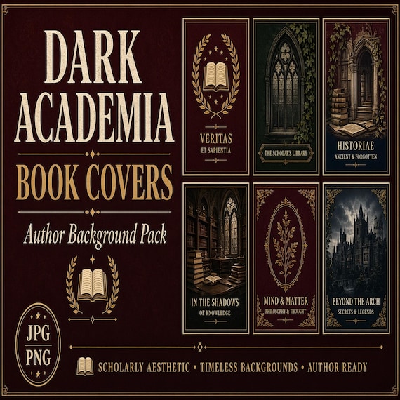
Dark Academia Book Cover Background Art
Dark Academia Book Cover Backgrounds is a digital book-cover background art pack for authors, cover designers, KDP creators, book…
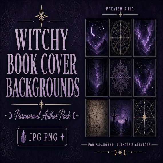
Witchy Paranormal Book Cover Background Art
Witchy Paranormal Book Cover Backgrounds is a digital book-cover background art pack for authors, cover designers, KDP creators…
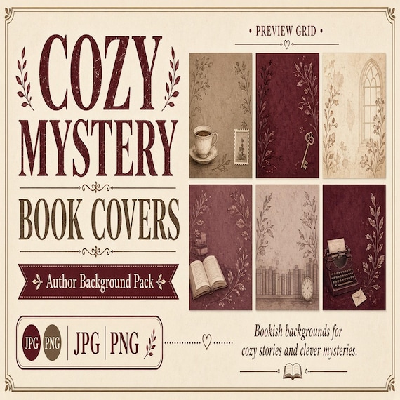
Cozy Mystery Book Cover Background Art
Cozy Mystery Book Cover Backgrounds is a digital book-cover background art pack for authors, cover designers, KDP creators, book…