Clipart PNG · Jul 19, 2026 · 11 min read
Coquette Bow Clipart Workflow: Build a Coordinated Sticker, Label, and Card Collection
A practical after-download workflow for choosing bow motifs, working with sheet and individual PNG files, building one reusable layout, testing real output, and turning a coquette clipart pack into a consistent set of finished stickers, labels, and cards.
Confirm what the current bow clipart download contains
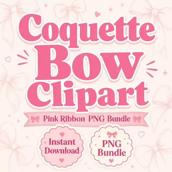
Start with the current product page and downloaded README rather than assuming that every clipart bundle is packaged the same way. The featured Coquette Bow Clipart PNG Bundle currently describes three finished full clipart sheets as JPG files, three transparent-background PNG sheet exports made from the same artwork, and individual transparent PNG crops where a clean separation was possible. It is a digital download; no printed stickers, labels, cards, or other physical pieces are shipped.
That distinction matters when you plan a project. A full sheet is useful for browsing the collection as a group, while an individual crop is easier to place as one design element. The phrase “where a clean separation was possible” also means you should inspect the actual downloaded folders before promising yourself a separate file for every object visible on a sheet. Open the README, compare the folders with the current listing, and choose a job that the files you actually received can support.
- Verify the current JPG sheets, PNG sheet exports, individual crops, and README after download.
- Treat the files as artwork assets for finished projects, not as ready-made physical products.
- Do not assume every visible motif has its own separate crop until you check the folder.
- Pause and ask for clarification if a project-critical format is not clear from the current materials.
Choose one finished collection before opening every file
Decide what you are making first: a small sticker set, a group of product labels, a thank-you card, a planner accent sheet, an invitation detail, or a coordinated mix of several pieces. Give the project a short name and write down the required finished sizes, quantity of variations, text that must appear, and production method. This turns a folder of attractive bows into a defined design task instead of an endless motif search.
Keep the first collection narrow. For example, a launch set might need one main bow for a card, two supporting bows for labels, and one tiny accent for a sticker or envelope seal. It does not need every artwork option on every piece. A limited group is easier to compare, proof, and reproduce. Once that small system works, you can extend it to another size or format without rebuilding the visual direction from scratch.
- Name the finished pieces and record their dimensions before arranging artwork.
- Choose the production method early because screen graphics, home prints, and cut pieces have different checks.
- Limit the first round to a main motif and a few supporting options.
- Build one coherent collection before creating extra versions.
Keep the source package intact and make a working copy
Store the original download, README, and current license note together in one clearly named master folder. Do not crop, flatten, rename, or overwrite those source files while experimenting. Make a separate project folder, then copy only the sheet exports and individual PNG files selected for the current collection. A clean master gives you a reliable starting point if a working document becomes compressed, distorted, or difficult to trace later.
Inside the project folder, use simple subfolders such as references, working files, proofs, and final exports. Keep the original filename in your working note even if you give a placed layer a friendlier name inside an editor. If several people prepare finished pieces for one business, share the finished project materials according to the current terms rather than circulating the entire raw asset package without checking what the README permits.
- Keep the untouched download and its usage note together.
- Copy selected assets into a project folder instead of editing the master files.
- Separate working documents, proofs, and approved exports.
- Retain enough filename information to locate the clean source again.
Use sheet exports for browsing and individual PNG files for composition
Open the full sheets first when you want to compare shape, detail, and overall style quickly. Mark a small shortlist by writing down the sheet filename and the motif's position on that sheet. Avoid building a final product from a screenshot of the listing or a cropped screen preview. Screenshots may be reduced, softened, or surrounded by a background that was never part of the downloadable artwork.
When the chosen bow has a separate transparent PNG crop, place a copy of that file into your working document. If it does not have a separate crop, use the full sheet only in a way that suits a finished sheet image, or select another supplied element that is already cleanly separated. Do not promise a transparent isolated motif by cutting hastily around a preview. The supplied file structure should determine the efficient path, and the finished edge should be inspected before production.
- Browse with the full sheets and compose with a supplied individual crop when available.
- Record where each shortlisted motif came from.
- Use the downloaded asset rather than a screenshot or listing preview.
- Choose another supplied element if the required clean separation is not present.
Assign each bow a role in the collection
Give every selected element a purpose. One bow can be the hero mark used on the largest card or label. A simpler bow can support secondary information. A small ribbon detail can repeat as an accent, divider, or corner element. This role map creates a family resemblance without making every item identical. It also prevents a detailed motif from being reduced until its lines are too small to read clearly.
Choose a restrained set of background colors, text colors, and type styles around those roles. The artwork should not have to compete with several decorative fonts, multiple border styles, and a different pink on every piece. If the finished item carries a product name, ingredients, a date, an address, or required instructions, that information comes first. Let the bow frame the message rather than interrupting it.
- Hero motif: the most recognizable element on the largest or most important piece.
- Supporting motif: a quieter option for labels and secondary cards.
- Accent motif: a small repeat used sparingly across the collection.
- Required information: always keep it readable ahead of decorative artwork.
Create one master layout and a controlled size ladder
Build the largest or most information-heavy piece first. Set its final dimensions, margins, text hierarchy, background, and bow placement in one master document. Import the transparent PNG at a useful size and resize proportionally from a corner so the shape is not stretched wider or taller. Keep an editable working version with the text and artwork on separate layers when your app supports that workflow.
Next, define a short size ladder instead of resizing by eye every time. Record the working width or height used for the hero, supporting, and accent roles. These measurements are project references, not universal rules; the correct result depends on the supplied pixels, the finished item, and the production method. Duplicate the master before adapting it. A controlled ladder keeps repeated bows visually related and makes an accidental outlier easier to spot.
- Start with the piece that has the tightest combination of text and artwork.
- Resize proportionally and avoid dragging only one side of the image.
- Keep one editable master before making smaller derivatives.
- Record the chosen motif sizes so later pieces can repeat them intentionally.
Inspect transparency, scale, and edge quality
Place each selected PNG over a temporary dark background, a light background, and the actual project color. This makes an unexpected rectangle, pale fringe, rough crop, or stray pixel easier to see. A checkerboard inside an app often represents transparency, but the real test is how the asset appears against the finished background. Remove the temporary inspection layer before export.
View the artwork at normal finished size as well as close up. Enlarging a raster file too far can soften edges or reveal pixels, while reducing a detailed bow too much can close small gaps and turn delicate details into a dark knot. Do not judge only from a heavily zoomed editor window. Print or export one measured proof, look at it from the distance at which the item will be used, and revise one variable at a time.
- Check every chosen PNG against contrasting colors and the real project background.
- Inspect for boxes, fringes, stray pixels, and rough edges.
- Review the design at its actual finished size, not only while zoomed in.
- Avoid extreme enlargement or reduction when the edge quality or detail no longer holds.
Adapt the master into stickers, labels, and cards without crowding
For a sticker, keep the silhouette and key internal details easy to understand at the planned cut size. Leave the spacing required by the cutting or printing method instead of placing artwork against the document edge. For a product label, reserve a calm area for the product name and any information the finished label needs. A decorative bow should not force important copy into tiny type or an awkward curved path.
For a card, use the larger canvas to create breathing room rather than adding every shortlisted element. Repeat the same hero or supporting bow, colors, and type hierarchy from the label so the pieces feel related. If you also make a planner accent or envelope seal, let it borrow one recognizable element from the system. The collection feels coordinated when decisions repeat, not when every available motif appears at once.
- Stickers: favor a clear silhouette and leave room for the actual cut method.
- Labels: protect the space needed for names and required information.
- Cards: use the larger area for hierarchy and breathing room.
- Small accents: repeat one known motif instead of introducing a new visual system.
Proof the design with the real production method
A screen preview cannot confirm how a finished piece will print, cut, laminate, press, or display. Follow the current instructions for your printer, paper, cutting machine, label supplier, transfer material, or production service. Confirm the required document size, color setting, margins, bleed, safe area, and accepted file format before preparing a batch. If a third-party service provides a template, place the artwork into that template rather than guessing from a screen mockup.
Produce one representative test using the real material whenever practical. Check color, edge sharpness, text size, adhesive or surface behavior, cut clearance, and the way the item looks under ordinary lighting. Colors can vary by device, software, printer, paper, export settings, and production method. Approve the test because it works in the real setting, not because the editor preview looked polished.
- Use the current specifications from the printer, material, machine, or production service.
- Check document size, safe area, bleed, margins, and accepted export format.
- Make one real proof before committing to a full batch.
- Review the result in normal light and at normal viewing distance.
Review copy, consistency, and usage terms before export
Read every line of finished text aloud or compare it with an approved source. Verify names, dates, prices, measurements, contact details, and any instructions the piece needs. Place the sticker, label, and card proofs side by side and check that the same colors, motif roles, spacing logic, and type hierarchy appear throughout. A collection can contain different layouts while still feeling like one deliberate set.
Reopen the current README before producing client work, products for sale, or a larger commercial run. The featured listing currently welcomes personal and small-commercial use for finished projects unless the included note says otherwise, and it does not allow the original download files to be resold, shared, or redistributed as-is. Keep the raw assets private, use them inside finished work according to the current terms, and request clarification when the planned use falls outside what you can verify.
- Proof all names, dates, prices, measurements, and instructions.
- Compare every piece together for consistent color, type, and motif roles.
- Use the current README as the final authority for the planned finished project.
- Do not redistribute the raw artwork files or package them as a competing asset download.
Name the exports and preserve a repeatable project record
Export only after the proof is approved. Use filenames that identify the collection, finished piece, size, version, and status, such as bow-launch_label-small_v2-approved. Keep approval words out of early drafts so an unfinished file is not sent to production by mistake. Open every final export outside the editing app and confirm that the dimensions, transparency, background, text, and edges survived the export.
Save a short project note with the source asset names, finished dimensions, chosen colors, type choices, production specifications, and date of the approved proof. Store the editable master separately from flattened production files. When a reorder or matching piece is needed, duplicate the proven master and update only the necessary information. That record turns a successful one-time design into a collection you can reproduce without guessing.
- Include the piece, size, version, and status in each export filename.
- Open final files outside the editor before sending or producing them.
- Keep the editable master, approved proof, and production export distinct.
- Record the successful design and production choices for future matching pieces.
Decide whether this bow pack fits the collection you want to make
Choose the featured bow pack when a feminine coquette and ribbon direction matches the finished stickers, labels, cards, planner accents, invitations, or small-shop graphics you have already defined. It is most useful when the current sheet and individual PNG structure suits your editing app and when the current usage note covers the finished project. Confirm the preview, download contents, and terms immediately before purchase because the current listing is the final source for what is included.
If the project needs a different subject, compare an existing related clipart direction such as bookish coquette, dog-themed, western, cleaning-business, or pickleball artwork rather than forcing pink bows into an unrelated message. Pick one visual family for the first collection and repeat it well. A good choice leaves you with a clear deliverable list, a small motif shortlist, one master layout to build, and a practical proof you can make before producing the full set.
- Use the bow pack when the coquette ribbon direction fits the written project brief.
- Verify that the supplied formats work in the app and production method you plan to use.
- Choose a different existing theme when the subject is a better match than decorative bows.
- Before Etsy checkout, confirm the current preview, files, digital-only delivery, and usage note.
Printables used in this guide
Instant downloads from the SteadyStackStudio Etsy shop.
Coquette Bow Clipart PNG Bundle
Coquette Bow Clipart PNG Bundle is a ready-to-use digital clipart download for printable sellers, sticker makers, sublimation…
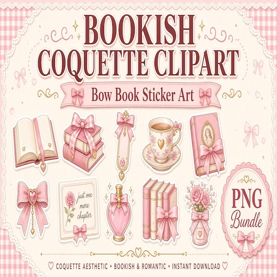
Bookish Coquette Clipart PNG Bundle
A polished digital artwork bundle for book bloggers, teachers, reader merch makers, sticker shops, scrapbookers, and printable…
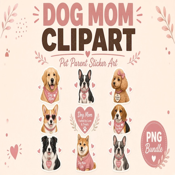
Dog Mom Clipart PNG Bundle
A finished transparent PNG clipart bundle for pet sticker shops, dog moms, groomer gift makers, sublimation sellers, and…
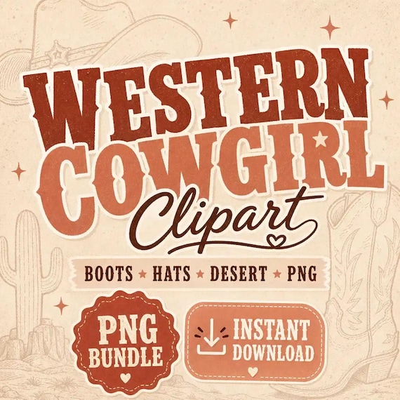
Cowgirl Clipart PNG Bundle
Western Cowgirl Clipart PNG Bundle is a ready-to-use digital clipart download for printable sellers, sticker makers, sublimation…