Small Business Templates · Jul 20, 2026 · 12 min read
How to Set Up Scent Cards for a Fragrance Display: Notes, Pairings, and Inventory
A practical setup guide for turning fragrance records into clear scent cards, pairing suggestions, display signs, and a repeatable sample-station system without letting customer-facing copy drift away from the working inventory.
Confirm what the current scent-card download includes
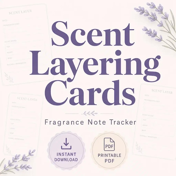
Begin with the actual files, because the tracker, cards, and signs do different jobs. The current SteadyStackStudio kit lists an Excel fragrance-note tracker, printable scent cards and display signs in PDF format, editable scent cards in PPTX format, a quick-start PDF, and a README with the license note. It is an instant digital download; printed cards, signs, fragrance products, and sampling supplies are not shipped.
Open the quick-start guide before editing a template, then keep one untouched copy of every original file. Use a working copy for your business name, product wording, colors, and layout changes. The Excel file is the internal reference, the cards help a customer understand individual scents or combinations, and the signs guide the broader display. Keeping those roles separate makes later updates much easier than treating every file as an independent design project.
- Keep the downloaded package and one unmodified extracted copy.
- Use the Excel tracker for working records rather than customer-facing presentation.
- Use the PDF pages when the supplied printable layout already fits the display.
- Use a PPTX working copy when the card wording or presentation needs editing.
Inventory the fragrances you already sell before editing a card
Do not begin by designing the prettiest card. Begin with a complete list of the scents that are actually available for the planned market, boutique shelf, candle bar, or sample table. Copy the exact product names from your current records, then distinguish permanent choices from seasonal, limited, or temporarily unavailable options. If two products share a fragrance name but use different formats or formulas, keep them as separate records until you know the customer card can describe them accurately.
Use the fragrance tracker to create a dependable source list and add only fields your own workflow can maintain. Useful working details may include the approved display name, internal product reference, confirmed note wording, availability, card status, and the date the record was last checked. These are setup suggestions, not a claim that every field is prebuilt. The goal is one place where you can verify the current information before changing a sign or printing another batch of cards.
- List only products that belong in the current display.
- Copy names and factual details from your own approved records.
- Separate permanent, seasonal, limited, and unavailable choices clearly.
- Give each record an owner or review date if more than one person edits the files.
Separate verified product facts from descriptive language
A scent card often combines factual product information with sensory description, and those two layers should not be confused. Product name, format, size, ingredients, and required warnings must come from the business's current source records and applicable requirements. Fragrance notes and mood words are descriptive tools. They should help someone imagine the direction of a scent without being presented as ingredients, medical effects, or guaranteed reactions.
Create a simple review rule before writing cards: factual text must match an approved record, while descriptive text must stay modest, specific, and easy to understand. Avoid therapeutic, medical, allergen, or safety claims, and do not infer ingredient content from a note name. A card that says a blend feels bright, warm, woody, or fresh is doing a different job from a product label. Keep required product and safety information in the places your business uses for those obligations rather than asking a small display card to replace them.
- Verify names, formats, and required product details against current records.
- Treat note language as description, not proof of ingredients or performance.
- Remove promises about mood, health, safety, or personal results.
- Have the responsible person approve wording before it reaches the display.
Build one card hierarchy for names, notes, and pairing ideas
Choose a repeatable reading order before filling every card. A practical hierarchy begins with the fragrance or product name, follows with one short line that describes its character, and then gives a compact note list or pairing suggestion. The exact order can change with your brand, but it should stay consistent across the set. A customer should not need to search a different corner of each card to find the name or decode a new label system for every scent.
Use the editable PPTX card as a master rather than redesigning each page. Approve the type sizes, spacing, label order, and maximum amount of text with one demanding example—the longest product name and the fullest approved description. If that example remains readable, shorter cards will be easier to manage. When a card is crowded, shorten the description or move secondary information to another resource instead of shrinking everything until it only works in a close-up preview.
- Put the product or fragrance name in the same prominent position on every card.
- Limit the descriptive line to one useful idea rather than a paragraph.
- Use consistent labels for notes, pairings, or collection names.
- Approve the layout with the longest realistic card before duplicating it.
Create pairing suggestions with a repeatable house method
Pairing cards are easiest to trust when the business uses one clear method instead of inventing a clever combination at the last minute. Start with products you know and have reviewed together. You might group related scent directions, build a familiar base with a contrasting accent, or offer a simple lighter-and-deeper comparison. Whatever method you choose, write it down so a second person can understand why two products appear together.
Keep the wording invitational. Phrases such as “try with,” “pairs well in our display,” or “compare beside” leave room for personal preference. Do not promise that a combination will smell identical on every person, perform the same in every product, or produce a health or emotional result. Before printing, let someone who did not write the card read the names and explain the pairing back to you. If the relationship is confusing without a spoken sales pitch, the card needs simpler language.
- Use only combinations your business has intentionally reviewed.
- Document the pairing reason in the working tracker or approval notes.
- Present pairings as suggestions rather than universal outcomes.
- Retire a pairing when either product is unavailable or the description no longer fits.
Keep the customer card and internal tracker synchronized
The display becomes unreliable when the printed card, editable slide, and inventory record all carry different names. Choose the tracker as the control point and give each card a simple status such as draft, proof, approved, printed, or retired. Those status labels can be added to your working system if useful; they are not a promise of built-in automation. Record the approved card wording or a clear reference to the approved version where the next editor can find it.
Make one change at a time. Update the working record, revise the PPTX master, export or print the new card, and remove the outdated physical copy. Avoid changing a PDF printout by hand while leaving the source file untouched, because the correction will disappear during the next print run. If the display is used in more than one location, note how many active copies exist and replace all of them together whenever the approved product name or description changes.
- Choose one record as the source for approved names and descriptions.
- Use clear card statuses if several drafts move through review and printing.
- Replace outdated cards instead of leaving two versions in circulation.
- Record the file name or revision date for the version that was approved.
Design a sample-station path that needs little explanation
Plan the station as a short customer path: notice the display, understand how choices are grouped, read one card, follow the business's normal sampling process, and make a selection or ask a focused question. Put the main sign where that sequence begins, not behind the products. Arrange cards in the same order as the products or sample references so a person can move from the description to the correct item without guessing.
Sampling materials and procedures are separate from this digital template kit. Use only the methods, supplies, sanitation practices, venue rules, and product instructions appropriate to your own business. The cards should reduce navigation questions, not instruct people to handle or apply a product in an unapproved way. Leave enough open space for one person to browse without covering labels or reaching across a payment area, and keep unavailable choices out of the active path.
- Place the main instruction sign at the beginning of the browsing path.
- Match the order of cards, products, and any sample references.
- Keep sampling directions aligned with your established practices and venue rules.
- Remove sold-out choices or mark them clearly before the next customer arrives.
Use editable signs to set expectations without overcrowding
A display sign should explain the station, while the individual card explains a scent. Use the editable sign or card file to create one concise headline and, if needed, one short instruction. Examples of useful jobs include naming the collection, showing where browsing starts, or explaining that pairing ideas are suggestions. Price, product details, and required notices should stay in their appropriate materials rather than being squeezed into one decorative sign.
Keep the sign visually related to the cards, but do not make every surface identical in size and weight. The main sign needs to be recognizable from farther away; card text is read at close range. Print a draft at the intended dimensions and place it beside the real products. If the sign hides stock, competes with price information, or makes the station feel like a wall of text, remove lines before reducing the type. A clear display usually needs fewer words than an editable template can hold.
- Give the main sign one job and the individual cards another.
- Keep instructions short enough to understand without a sales explanation.
- Do not let decorative copy replace required product information.
- Remove unnecessary lines before shrinking the type size.
Print one representative card and test it at the real display
Before producing the whole set, print one card that represents the hardest case: a long name, several approved notes, and a pairing line. If you edited the PPTX, review the exported or printed result rather than trusting the slide view alone. Check the page size, scale, margins, crop, line breaks, and whether any substituted font changes the spacing. The printable PDF pages can also be tested directly when the supplied layout already matches the intended use.
Use the printer, paper, and finishing method planned for the actual display. A design that looks balanced on screen can become faint, cramped, or unexpectedly glossy after printing. Mark the proof with its date and file name, then write down the approved print settings. If the first result fails, change one variable—such as scale, paper, type size, or copy length—and print the same demanding card again. That controlled comparison is more useful than printing the full set with several untested changes.
- Choose the densest realistic card for the first proof.
- Check the physical output for cropping, font changes, and weak contrast.
- Test with the same printer and paper planned for the finished display.
- Save the approved file name and print settings with the working records.
Check contrast, distance, lighting, and handling
Place the proof where the card will actually sit and inspect it under the normal room, booth, or shop lighting. Read the main name from the customer's likely standing position, then step closer for the note details. Watch for glare, shadows from shelves, patterned tablecloths, and nearby packaging that competes with the text. A card may have strong contrast by itself and still disappear when surrounded by busy products.
Test the normal handling pattern as well. If cards remain in holders, confirm the holder does not cover the bottom line. If customers or staff pick them up, make sure the print and paper choice suit that routine and can be replaced when worn. Keep cards away from unstable edges and from any area where a spill or product contact would make them hard to read. The template provides the layout starting point; the physical display still needs a real-world fit check.
- Read the headline from the expected browsing position.
- Check detail text at the distance where a customer will hold or view the card.
- Inspect the proof under the actual lighting and beside the real packaging.
- Confirm stands, clips, or holders do not cover important wording.
Add new scents without breaking the approved system
When a new fragrance is ready for the display, duplicate the approved master card rather than starting from a blank slide. Add the product to the tracker, verify the name and source details, write the description under the same rules, review any pairing suggestion, and move the card through the same proof process. This keeps a seasonal release from becoming a different visual system simply because it was prepared in a hurry.
Remove old versions deliberately. Mark a retired or unavailable item in the working record, archive its editable card, and take the physical card out of the active set. Do not overwrite the last approved file if the fragrance may return later; use a clear version or season label. If a temporary product has a limited quantity, update availability through the business's normal sales process instead of printing a claim that could become false while the card remains on the table.
- Duplicate the approved master rather than rebuilding the layout.
- Apply the same fact check, copy review, and proof steps to every addition.
- Archive retired cards away from the active print folder.
- Avoid permanent printed availability claims for inventory that changes quickly.
Close the event with a clean restock and change log
At the end of a market or retail period, separate three kinds of notes: inventory or availability changes, wording questions customers repeatedly raised, and physical display problems. Update the tracker with confirmed changes, flag cards that need review, and record which signs were hard to see or easy to misunderstand. Do not rewrite approved copy from memory while packing up; capture the question, then verify the answer against the proper record before the next print.
Store clean cards and signs flat or in the protective system already used for your booth materials. Keep the approved digital files, a blank master, and the current tracker together in a clearly named folder with a backup. Before the next event, run a short readiness check: active scents match the tracker, printed cards match the approved versions, pairing cards point to available products, and the main sign still describes the station accurately. That review keeps a polished display from drifting after several small changes.
- Record customer questions as review prompts, not instant factual answers.
- Update availability and retire outdated physical cards before storage.
- Keep the tracker, approved card files, and print notes together.
- Run one active-list-to-card check before the next setup.
Decide whether this template kit fits your retail setup
This scent-card kit is the strongest fit when you want an editable connection between an Excel fragrance tracker, printable PDF cards and signs, and PPTX cards that can be adapted to a boutique, candle bar, soap or bath-and-body display, or pop-up table. It works best for a business willing to supply and review its own accurate product wording, print a physical proof, and maintain the records as scents change. Check the current Etsy previews and file details before purchase to confirm the layouts suit your software and display.
Choose a different tool when the main need is formulation, required labeling, compliance guidance, automated online inventory, or shipped physical signage; this digital template does not provide those services. The handmade soap-and-candle card kit is a closer match when batch labels and product cards are the central job. The inventory, burn-test, batch-record, and broader maker-business downloads support other parts of a soap or candle workflow. Use the jewelry display tag kit when the table centers on jewelry stock rather than fragrance. Select the smallest complete system that solves the current record-and-display problem.
- Choose this kit for linked fragrance records, editable cards, and printable display signs.
- Skip it when you need physical signs, formulation help, compliance review, or live software automation.
- Compare adjacent maker tools by the job they perform, not by the number of files.
- Confirm software fit, current previews, digital-only delivery, and license terms before checkout.
Printables used in this guide
Instant downloads from the SteadyStackStudio Etsy shop.
Fragrance Note Cards and Scent Tracker
Scent layering card templates for fragrance makers and retailers: 20 printable PDF sheets with layering cards (top/heart/base)…
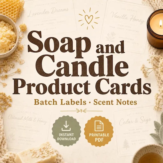
Candle Care Card and Soap Label Templates
Soap and candle makers who need real label/card sheets for markets and shops — not a thin one-page mockup.
Candle and Soap Inventory Spreadsheet
This system is built for real small-batch makers who need to track batches, costs, supplies, tests, inventory, product-card…
Candle Burn Test Log Spreadsheet
Candle burn test tracker spreadsheet — Excel-first wick test log, batch record, and burn-rate (g/hr) formulas — plus a 13-page…